Weather Forecast Card
The Weather Forecast card displays the weather. Very useful to include on interfaces that people display on the wall.
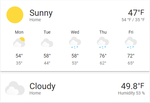 Screenshot of the Weather card.
To add the Weather card to your user interface, click the menu (three dots at the top right of the screen) and then Edit Dashboard. Click the Add Card button in the bottom right corner and select from the card picker.
Card Settings
The name of the location where the weather platform is located. If not set, the name will be the name set on the weather entity
Here you can specify a secondary attribute to show under the current temperature. Ex. Extrema, Precipitation, Humidity. If not set, it will default to Extrema (High/Low) if available, if not available then Precipitation and if precipitation isn’t available then Humidity.
Name of any loaded theme to be used for this card. For more information about themes, see the frontend documentation.
This card works only with platforms that define a weather entity.
E.g., it works with OpenWeatherMap but not OpenWeatherMap Sensor
YAML Configuration
The following YAML options are available when you use YAML mode or just prefer to use YAML in the Code Editor in the UI.
Configuration Variables
Type of forecast to display, one of daily, hourly or twice_daily.
Automatically selects in order of daily, hourly and twice_daily.
Which attribute to display under the temperature.
Defaults to extrema if available, if not available then precipitation and if precipitation isn’t available then humidity.
Override the used theme for this card with any loaded theme. For more information about themes, see the frontend documentation.
The action taken on card tap. For more information, see the action documentation.
The action taken on card tap and hold. For more information, see the action documentation.
The action taken on card double-tap. For more information, see the action documentation.
Example
show_current: true
show_forecast: true
type: weather-forecast
entity: weather.openweathermap
forecast_type: daily
Advanced
Themeable Icons
The default weather icons are themable via a theme. Theme variables include:
--weather-icon-cloud-front-color
--weather-icon-cloud-back-color
--weather-icon-sun-color
--weather-icon-rain-color
--weather-icon-moon-color
Example theme configuration:
--weather-icon-cloud-front-color: white
--weather-icon-cloud-back-color: blue
--weather-icon-sun-color: orange
--weather-icon-rain-color: purple
Personal Icons
Weather icons can be overwritten with your own personal images via a theme. Theme variables include:
--weather-icon-clear-night
--weather-icon-cloudy
--weather-icon-fog
--weather-icon-lightning
--weather-icon-lightning-rainy
--weather-icon-partlycloudy
--weather-icon-pouring
--weather-icon-rainy
--weather-icon-hail
--weather-icon-snowy
--weather-icon-snowy-rainy
--weather-icon-sunny
--weather-icon-windy
--weather-icon-windy-variant
--weather-icon-exceptional

// If your state is not above, use this format
--weather-icon-<state>
Example theme configuration:
--weather-icon-sunny: url("/local/sunny.png")