Tile Card
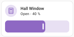
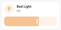
The tile card gives you a quick overview of your entity. The card allows you to toggle the entity and show the more info dialog. A badge is shown for some entities like the climate or person entities.
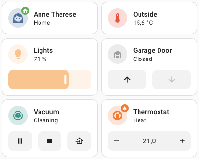 Screenshot of Tile cards.
To add the Tile card to your user interface, click the menu (three dots at the top right of the screen) and then Edit Dashboard. Click the “Add Card” button in the bottom right corner and select Tile from the card picker.
Configuration Variables
Set the color when the entity is active. By default, the color is based on state, domain, and device_class of your entity. It accepts color token or hex color code.
If your entity has a picture, it will replace the icon.
Action taken on card tap. See action documentation. By default, it will show the “more-info” dialog.
Action taken on icon card tap. See action documentation. By default, it will toggle the entity (if possible), otherwise, show the “more-info” dialog.
Additional widgets to control your entity. See available features.
Examples
Alternatively, the card can be configured using YAML:
type: tile
entity: cover.kitchen_window
type: tile
entity: light.bedroom
icon: mdi:lamp
color: yellow
type: tile
entity: person.anne_therese
show_entity_picture: true
type: tile
entity: person.anne_therese
vertical: true
type: tile
entity: vacuum.ground_floor
features:
  - type: vacuum-commands
    commands:
      - start_pause
      - return_home
Available color tokens
Some color tokens are available to colorize the tile card : primary, accent, disabled, red, pink, purple, deep-purple, indigo, blue, light-blue, cyan, teal, green, light-green, lime, yellow, amber, orange, deep-orange, brown, grey, blue-grey, black and white.
Tile features
Some entities have support for “features”. These widgets add quick controls to the tile card.
Alarm modes
Widget that display buttons to arm and disarm an alarm.
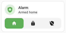 Screenshot of the tile card with alarm modes feature
features:
  - type: "alarm-modes"
    modes:
      - armed_home
      - armed_away
      - armed_night
      - armed_vacation
      - armed_custom_bypass
      - disarmed
Climate HVAC modes
Widget that displays buttons to control the HVAC mode for a climate.
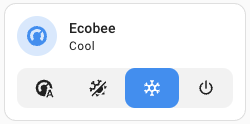 Screenshot of the tile card with the climate HVAC modes feature
features:
  - type: "climate-hvac-modes"
    hvac_modes:
      - auto
      - heat_cool
      - heat
      - cool
      - dry
      - fan_only
      - "off"
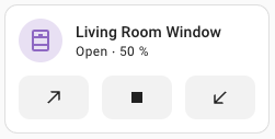
Cover open/close
Widget that displays buttons to open, close, or stop a cover.
 Screenshot of the tile card with cover open/close feature
features:
  - type: "cover-open-close"
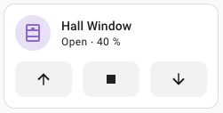
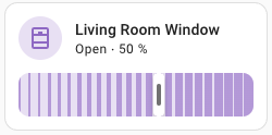
Cover position
Widget that displays a slider to control the position for a cover.
 Screenshot of the tile card with the cover position feature
features:
  - type: "cover-position"
Cover tilt
Widget that displays buttons to open, close, or stop a cover.
 Screenshot of the tile card with cover tilt feature
features:
  - type: "cover-tilt"
Cover tilt position
Widget that displays a slider to control the tilt position for a cover.
 Screenshot of the tile card with the cover tilt position feature
features:
  - type: "cover-tilt-position"
Fan speed
Widget that displays speed controls for a fan.
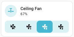 Screenshot of the tile card with fan speed feature
features:
  - type: "fan-speed"
Lawn mower commands
Widget that displays buttons to control a lawn mower.
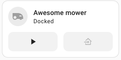 Screenshot of the tile card with the lawn mower commands feature
features:
  - type: "lawn-mower-commands"
    commands:
      - start_pause
      - dock
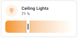
Light brightness
Widget that displays a slider to select the brightness for a light.
 Screenshot of the tile card with light brightness feature
features:
  - type: "light-brightness"
Light color temp
Widget that displays a slider to select the color temperature for a light.
 Screenshot of the tile card with the light color temperature feature
features:
  - type: "light-color-temp"
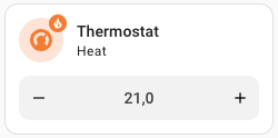
Target temperature
Widget that displays buttons to select the target temperature for a climate or a water heater.
 Screenshot of the tile card with the target temperature feature
features:
  - type: "target-temperature"
Vacuum commands
Widget that displays buttons to control a vacuum.
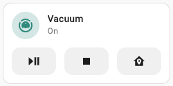 Screenshot of the tile card with vacuum commands feature
features:
  - type: "vacuum-commands"
    commands:
      - start_pause
      - stop
      - clean_spot
      - locate
      - return_home
Water heater operation modes
Widget that displays buttons to control the operation mode of a water heater.
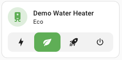 Screenshot of the tile card with the water heater operation modes feature
features:
  - type: "water-heater-operation-modes"
    operation_modes:
      - electric
      - gas
      - heat_pump
      - eco
      - performance
      - high_demand
      - "off"