Picture Glance Card
The Picture Glance card shows an image and corresponding entity states as an icon. The entities on the right side allow toggle actions, others show the more information dialog.
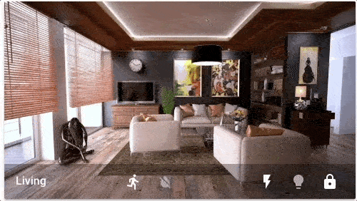 Picture glance card for a living room.
To add the Picture Glance card to your user interface, click the menu (three dots at the top right of the screen) and then Edit Dashboard. Click the Add Card button in the bottom right corner and select from the card picker.
YAML Configuration
The following YAML options are available when you use YAML mode or just prefer to use YAML in the Code Editor in the UI.
Configuration Variables
Background image based on entity state.
Forces the height of the image to be a ratio of the width. Valid formats: Height percentage value (23%) or ratio expressed with colon or “x” separator (16:9 or 16x9). For a ratio, the second element can be omitted and will default to “1” (1.78 equals 1.78:1).
Override the used theme for this card with any loaded theme. For more information about themes, see the frontend documentation.
Action taken on card tap. See action documentation.
Action taken on card tap and hold. See action documentation.
Action taken on card double tap. See action documentation.
Options For Entities
If you define entities as objects instead of strings, you can add more customization and configuration:
Configuration Variables
Action taken on card tap. See action documentation.
Action taken on card tap and hold. See action documentation.
Action taken on card double tap. See action documentation.
Options For Exemptions
How to use state_filter
Specify different CSS filters
state_filter:
  "on": brightness(110%) saturate(1.2)
  "off": brightness(50%) hue-rotate(45deg)
entity: switch.decorative_lights
Examples
type: picture-glance
title: Living room
entities:
  - switch.decorative_lights
  - light.ceiling_lights
  - lock.front_door
  - binary_sensor.movement_backyard
  - binary_sensor.basement_floor_wet
image: /local/living_room.png
Display a camera image as background:
type: picture-glance
title: Living room
entities:
  - switch.decorative_lights
  - light.ceiling_lights
camera_image: camera.demo_camera
Display a camera image without additional entities:
type: picture-glance
title: Front garden
entities: []
camera_image: camera.front_garden_camera
Use different images based on entity state:
type: picture-glance
title: Living room
entities:
  - switch.decorative_lights
  - light.ceiling_lights
state_image:
  "on": /local/living_room_on.png
  "off": /local/living_room_off.png
entity: group.living.room